Portfolio
Brand Design, Web Design


Project Title:
Fierce Facials
Brief Overview:
Fierce Facials is a Durban-based mobile clinic that required a brand and web design to showcase their services.
Project Goals – Brand Design:
- Client questionnaire
- Competitor analysis
- Mood board
- Logo design
- Business card design
Project Goals – Web Design:
- Hosting setup
- WordPress installation
- Creation of website banners
- Design of service illustrations
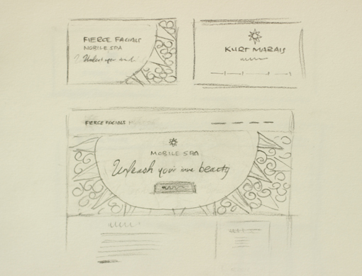
- Wireframing
- Pages content and layout design
- Responsiveness for tablet and mobile
- Browser compatibility
Client Background: Kurt Marais is a multi-faceted professional: a qualified flight attendant, a Gyrotonic instructor (a holistic movement system rooted in Yoga, Dance, Tai Chi, and Swimming practised on specialised equipment), a professional dancer, and a Skin Specialist Therapist.
Role & Responsibilities: As the Designer, I engaged in discussions with the client, conducted initial research, conceptualised ideas, and followed the detailed processes below:
Research: The first phase entailed a thorough questionnaire and discussion with the client to grasp his services and vision. This was followed by an analysis of existing spas in Durban to discern Fierce Facials’ unique selling proposition and potential brand visual identity.
Conceptualisation: Three brand identity concepts were introduced. The sun logo, symbolising the slogan ‘unleash your inner beauty’, resonated most with the client. Symbolically, the sun represents radiating confidence, the drive to achieve, and the embodiment of a luminous presence that transcends gender boundaries.
Iterations: The design underwent three iterations, each with distinct visual elements, colour palettes, and graphical components centred around the sun motif.
Prototypes: The primary website prototype was showcased as a PDF presentation, detailing a mockup view.
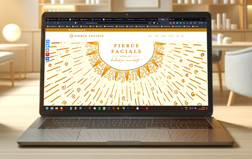
Final Solution/Design: The adopted design embraced the third iteration’s essence: vectorised hand-drawn illustrations with a focus on illuminating light and sun-centric imagery. The design’s form was inspired by the religious iconography of sun-worshipping cultures. The twirls denote heat, while the triangles and lines denote light.
Tools & Technologies Used: A mix of traditional and modern tools, ranging from paper notebooks and pencils to Photoshop, Illustrator, WordPress, and beyond.
Results & Impact: The client expressed immense satisfaction, further entrusting us with his vehicle’s branding.
Client Feedback: The client lauded the designs as ‘FABULOUS’ and ‘BRILLIANT!’.
Challenges & Learnings: A significant challenge was crafting a unique sun image. The solution lay in thorough research and iterative concept sketches, culminating in vectorising a hand-drawn sketch to ensure logo distinctiveness.
Call to Action: For brand identity or web design inquiries, contact: info@riaanwilmans.co.za. Experience the live version of this website at fiercefacials.co.za.
